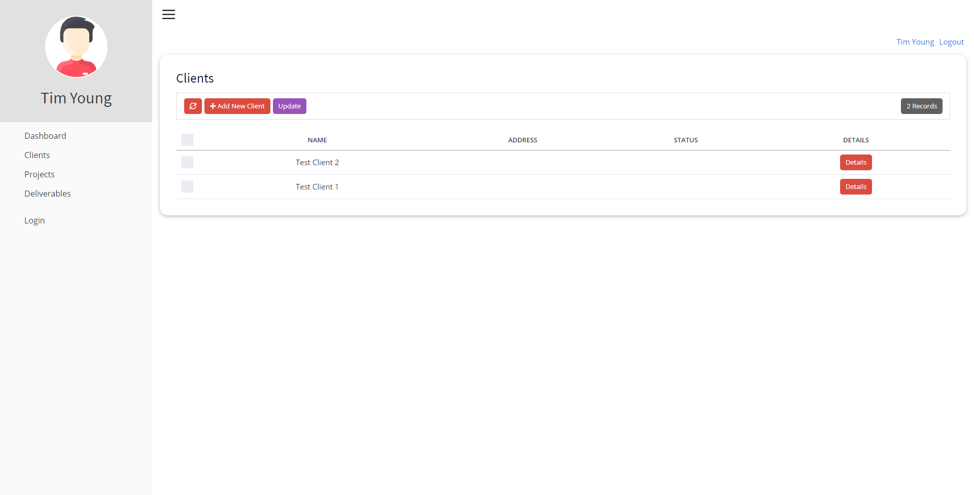
For apps that are built for internal business solutions, side navigation offers some advantages in regards to fast navigation between pages and a cleaner overview of main pages and sub-pages by positioning them out of the main application area.
Side Navigation vs. Top Navigation
I will be the first to admit that I'm obsessed with sidebars and side navigation. I plan to seek professional help shortly, but first - we need to discuss the differences between side navigation and top navigation.
My personal opinion on the matter is that it's up to personal preference; however, there are some strategic design practices at play.
- For apps that are built for internal business solutions, side navigation offers some advantages in regards to fast navigation between pages and a cleaner overview of main pages and sub-pages by positioning them out of the main application area.
- Does your Primary Navigation heavily depend on item priority? Source
Have you heard about the F Scanning Pattern in UX? People scan webpages and phone screens in various patterns, one of them being the shape of the letter F.
Here’s what it looks like: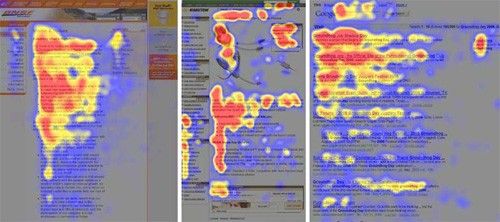
F Shaped Pattern from Nielsen Norman Group
According to an article titled ‘F-Shaped Pattern of Reading on the Web: Misunderstood, But Still Relevant (Even on Mobile)’ by the Nielsen Norman Group:
The F-shaped scanning pattern is characterized by many fixations concentrated at the top and the left side of the page. Specifically:
- Users first read in a horizontal movement, usually across the upper part of the content area. This initial element forms the F’s top bar.
- Next, users move down the page a bit and then read across in a second horizontal movement that typically covers a shorter area than the previous movement. This additional element forms the F’s lower bar.
- Finally, users scan the content’s left side in a vertical movement. Sometimes this is a slow and systematic scan that appears as a solid stripe on an eye-tracking heatmap. Other times users move faster, creating a spottier heatmap. This last element forms the F’s stem.
The implications of this pattern are:
- First lines of text on a page receive more gazes than subsequent lines of text on the same page.
- The first few words on the left of each line of text receive more fixations than subsequent words on the same line.
Hence, if your primary navigation constitutes of items with varying levels of priority you’d want the users to first scan the most important item — this is beautifully taken care of by the Top Navigation because it has a horizontal scrolling direction that people often use when they are reading.
Creating the side navigation
Step 1 - Components & HTML
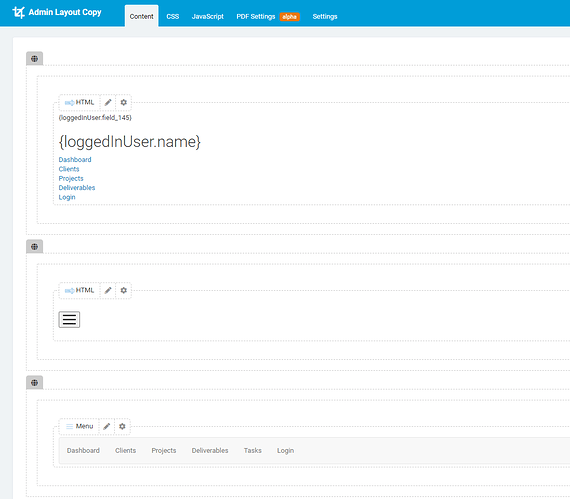
Overview:
- Create 2 rows on a page layout
- The top row contains the Menu HTML
- Click the Row settings and give it a custom css class of “sidenav” - no quotes, just the text
- The second row contains a button to toggle the menu
- In my case, I also created a third row that contains a native menu component to display on mobile only.
Menu Row - HTML Component
<nav class="menu">
<header class="avatar">{loggedInUser.Image}
<h2>{loggedInUser.Name}</h2>
</header>
<ul>
<li class="menuLink"><a href="https://yourapp.com/page1">Page 1</a></li>
<li class="menuLink"><a href="https://yourapp.com/page2">Page 2</a></li>
<li class="menuLink"><a href="https://yourapp.com/page3">Page 3</a></li>
<li class="menuLink"><a href="https://yourapp.com/page4">Page 4</a></li>
</ul>
<ul>
<li class="menuLink"><a href="https://yourapp.com/login">Login</a></li>
</ul>
</nav>
Toggle Button Row - HTML Component
<p style="text-align: left;"><button id="toggle" class="btn-nav"><img src="https://www.flaticon.com/svg/static/icons/svg/1828/1828859.svg" width="25px" height="25px" /></button></p>
You can use any image or icon for the Toggle button. I grabbed this URL from FlatIcon for demonstration purposes only.
Step 2 - Layout CSS
Add this code to your Layout CSS page.
/* --- Sidenav Toggle Button --- */

.btn-nav {
    background-color: transparent;
    border: none;
    padding: 5px;
}

.btn-nav:hover {
    /*background-color: #674ea7;*/
    border-radius: 25px;
}

.btn-nav:focus {
    outline: none;
}


/* --- Image and Thumb Wrap - used for sidenav avatar --- */

.thumb-wrap {
    max-width: 125px;
    max-height: 125px;
    overflow: hidden;
    margin: auto;
}

.thumb-wrap img {
    max-height: 125px;
    max-width: 125px;
    margin: 0 auto;
    display: block;
    padding: 2px;
    background-color: #fff;
    height: auto;
}


/* ===================================================================================================================== */


/* --- BEGIN SIDENAV --- */


/*This moves the whole application over the width of the sidebar that is set under '.menu' These values need to match */

@media  only screen and (min-width: 768px) {
    .app {
        margin-left: 300px;
    }
}

.app-nav {
    margin-left: 0px;
}


/* This is toggled with a button to "close" the sidenav */

.menuhide {
    display: none;
}


/* Menu Settings */

.menu {
    color: white;
    background: #FAFAFA;
    height: 100vh;
    width: 300px;
    position: fixed;
    top: 0;
    left: 0;
    z-index: 5;
    outline: none;
}

.menuLink a {
    color: #3c3c3c;
    padding: 0.5em 1em 0.5em 3em;
    width: 100%;
    display: block;
    text-decoration: none;
    font-size: 16px;
}

.menuLink a:hover {
    background-color: rgba(0, 0, 0, 0.1);
}

.menuLink a:focus {
    background-color: rgba(0, 0, 0, 0.1);
}

.menu .avatar {
    background: rgba(0, 0, 0, 0.1);
    padding: 2em 0.5em;
    text-align: center;
}

.menu .avatar img {
    border-radius: 50%;
    overflow: hidden;
    /*border: 4px solid #02dcff;*/
}

.menu .avatar h2 {
    font-weight: normal;
    margin-bottom: 0;
    color: #3c3c3c !important;
}

.menu ul {
    list-style: none;
    padding: 0.5em 0;
    margin: 0;
}

.menu ul li {
    font-size: 0.95em;
    font-weight: regular;
    transition: all 0.15s linear;
    cursor: pointer;
}

.menu ul li:focus {
    outline: none;
}
Step 3 - Layout JavaScript
Add this code to your Layout JavaScript page
$('#toggle').click(function(){
   $('.sidenav').toggleClass('menuhide');
   $('.app').toggleClass('app-nav');
});
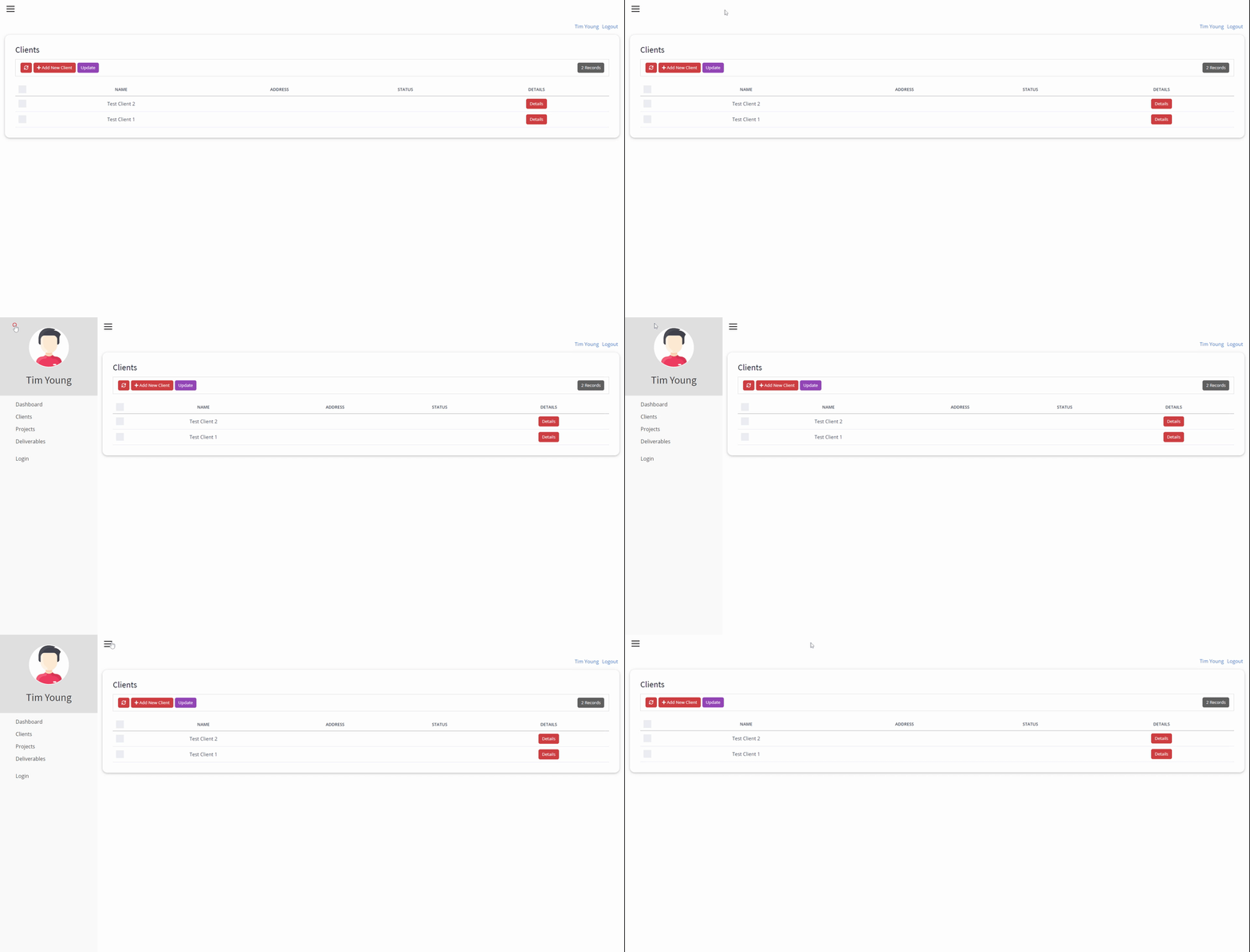
The end result gives you something like this
Published by


